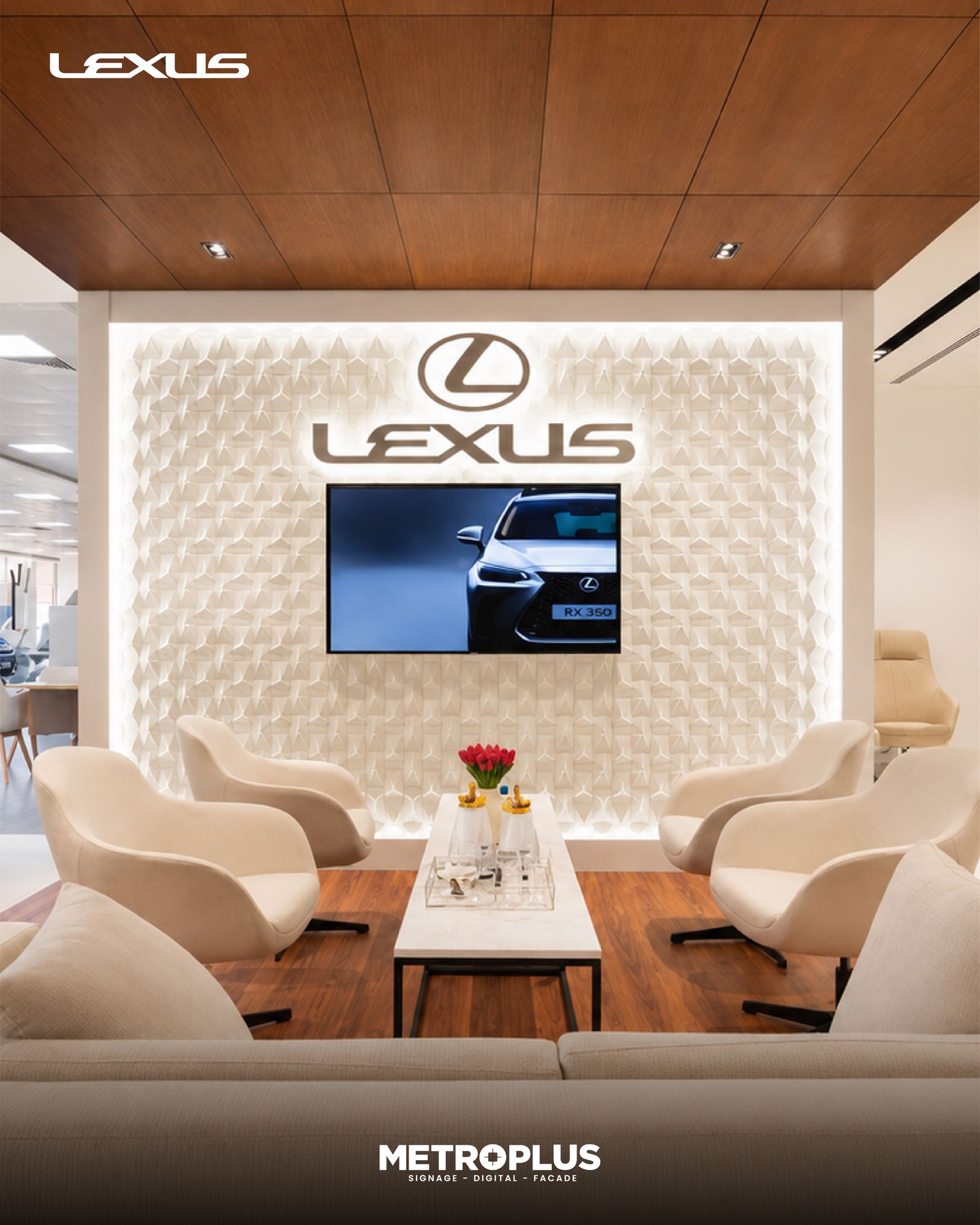
Colour temperature (CCT), measured in Kelvin, is one of the most under-specified decisions on an illuminated sign brief — and one of the most visible once the sign is lit. Getting it wrong doesn’t just look slightly off; it can make a brand’s signature colour read as a different colour entirely once the sun goes down.
What CCT actually describes
Colour temperature describes the visual warmth or coolness of white light, not its brightness. Lower Kelvin values look warmer (more amber/yellow), higher Kelvin values look cooler (more blue-white):
- 2700K–3000K (warm white): the tone of traditional incandescent or halogen lighting — amber, inviting, associated with hospitality, heritage, and premium/boutique retail.
- 3500K–4000K (neutral white): a balanced tone often used where brand colour accuracy matters but a fully clinical look isn’t wanted.
- 5000K–6500K (cool/daylight white): a crisp, blue-leaning white associated with pharmacies, electronics retail, supermarkets, and signage intended to read as sharp and modern from a distance.
How CCT changes brand perception
The same red channel letter face will look noticeably different lit at 3000K versus 6500K: warm white pulls the red toward orange, while cool white keeps it closer to true red but can make it look slightly harsher. Brands with saturated primary colours (red, blue) in their identity generally need to test their actual colour under both CCT options before locking a spec, because the “correct” brand colour on a colour swatch and the “correct-looking” lit sign are not always produced by the same light source.
How CCT affects legibility
Cool white generally reads as brighter and sharper at distance, which is why cool white dominates categories where fast legibility matters — pharmacy crosses, fuel station canopies, transit signage. Warm white can lose slightly perceived brightness at the same lumen output, which matters for signage that needs to be read quickly from a moving vehicle or across a wide plaza, but works well for signage meant to be experienced up close, such as boutique storefronts, restaurant fascia, and hospitality wayfinding.
Matching CCT to category and context
| Application | Typical CCT choice | Why |
|---|---|---|
| Luxury retail / boutique fascia | 2700K–3000K | Warmer tone supports a premium, inviting first impression |
| F&B and hospitality signage | 2700K–3200K | Matches ambient warm interior lighting and feels welcoming |
| Pharmacy, healthcare, supermarket | 5000K–6500K | Cooler tone reads as clean, clinical, and highly legible |
| Electronics, tech retail | 5000K–6500K | Reinforces a modern, high-tech brand feel |
| Mixed-use facade or building signage | 3500K–4000K | Neutral tone avoids clashing with adjacent warm or cool architectural lighting |
Practical specification advice
Whenever possible, request a physical lit sample of the sign face at the proposed CCT before committing to a full production run, especially for saturated brand colours. Also confirm CCT consistency requirements across the LED modules being used — see our related explainer on why two 4000K LEDs can look different for why a stated Kelvin value alone doesn’t guarantee a visual match across a sign face.
Frequently Asked Questions
What CCT is most common for retail channel letters in the UAE?
Neutral to cool white (4000K–6500K) is common for high-visibility retail fascia, while warm white (2700K–3000K) is frequently chosen for hospitality, F&B, and premium/boutique brands.
Can I mix warm and cool white on the same shopfront?
It’s possible but generally discouraged unless deliberately designed — mismatched CCT across a shopfront (e.g. warm-lit signage against cool-lit architectural lighting) tends to look unintentional rather than styled.
Does CCT affect LED lifespan or energy use?
Not significantly on its own — lifespan and efficiency are driven more by LED chip quality, driver design, and thermal management than by CCT choice.
How do I know which CCT matches my brand colour best?
Request physical lit samples of your actual sign colour under both warm and cool white LEDs before finalising — this is the only reliable way to predict how a colour will read once illuminated.
Specify the right colour temperature for your sign
Share your brand colours and sign location and our team will recommend and sample the right CCT before production. Contact us to request a lit colour sample.
Recommended Posts
LED Signage Retrofit: Repair or Replace Your Lighting
Should you repair, retrofit or replace an illuminated sign? An unlit or uneven sign does not always need complete replacement. It may need a local rep...

Signage Vendor Checklist for Architects and Consultants
A signage vendor checklist for architects and consultants Selecting a signage vendor requires more than comparing a finished photograph and a lump-sum...